Airline Booking App Design Exploration
Category
Concept Project
TIME TAKEN
1 day
TOols
Figma, Dribbble
industry
Travel
Introduction
Introduction
This concept project involved designing a user-friendly flight booking app. I undertook the entire design process independently, from research to high-fidelity designs. The goal was to streamline the flight booking process and enhance the user experience. The project was completed within a day, showcasing my ability to rapidly create a comprehensive design from scratch.
The Problem
Booking a flight takes too many clicks
Booking a flight takes too many clicks. Existing apps were often overloaded with features, making it difficult for users to find and book flights efficiently.
The Solution
Lesser clicks, simpler interface
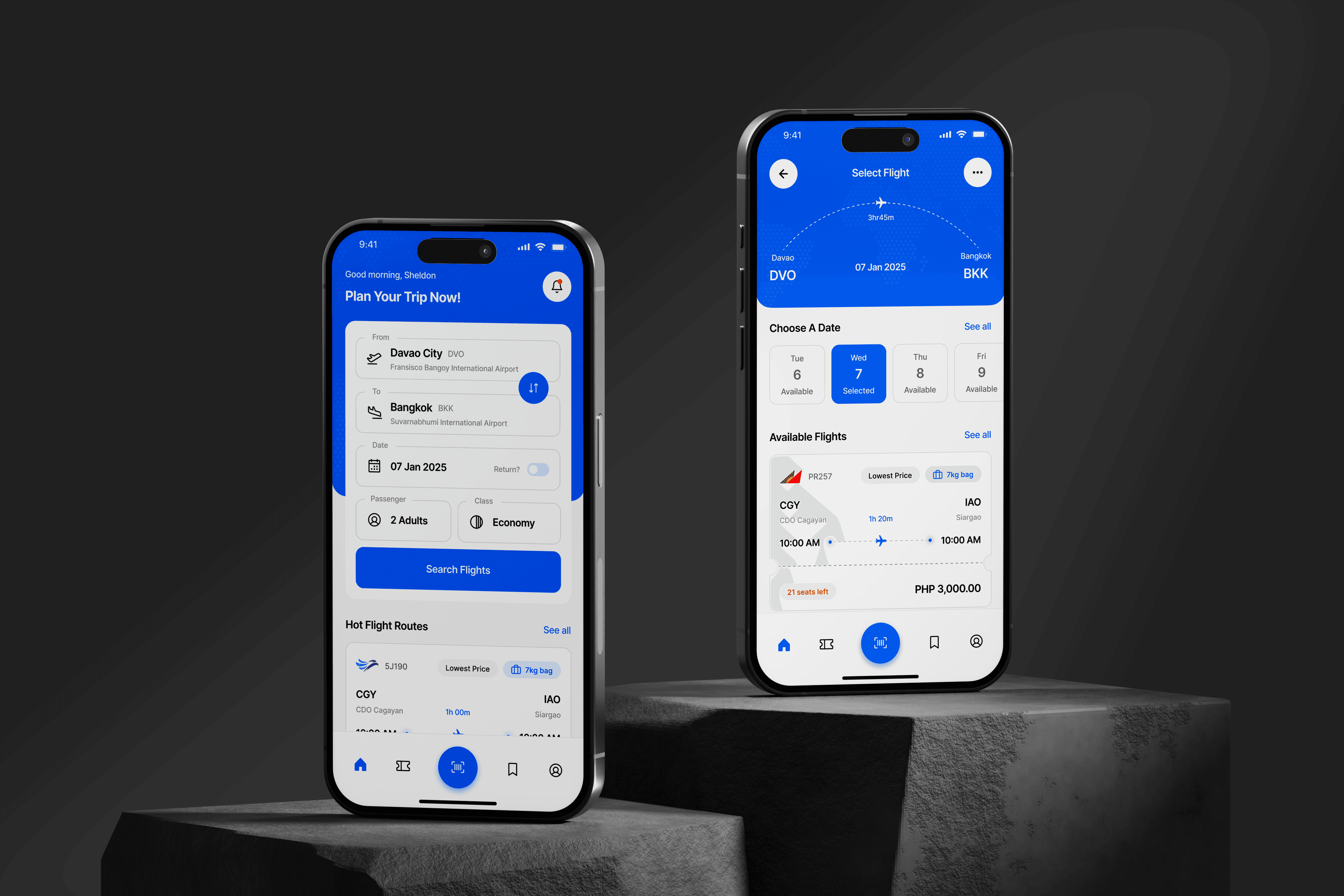
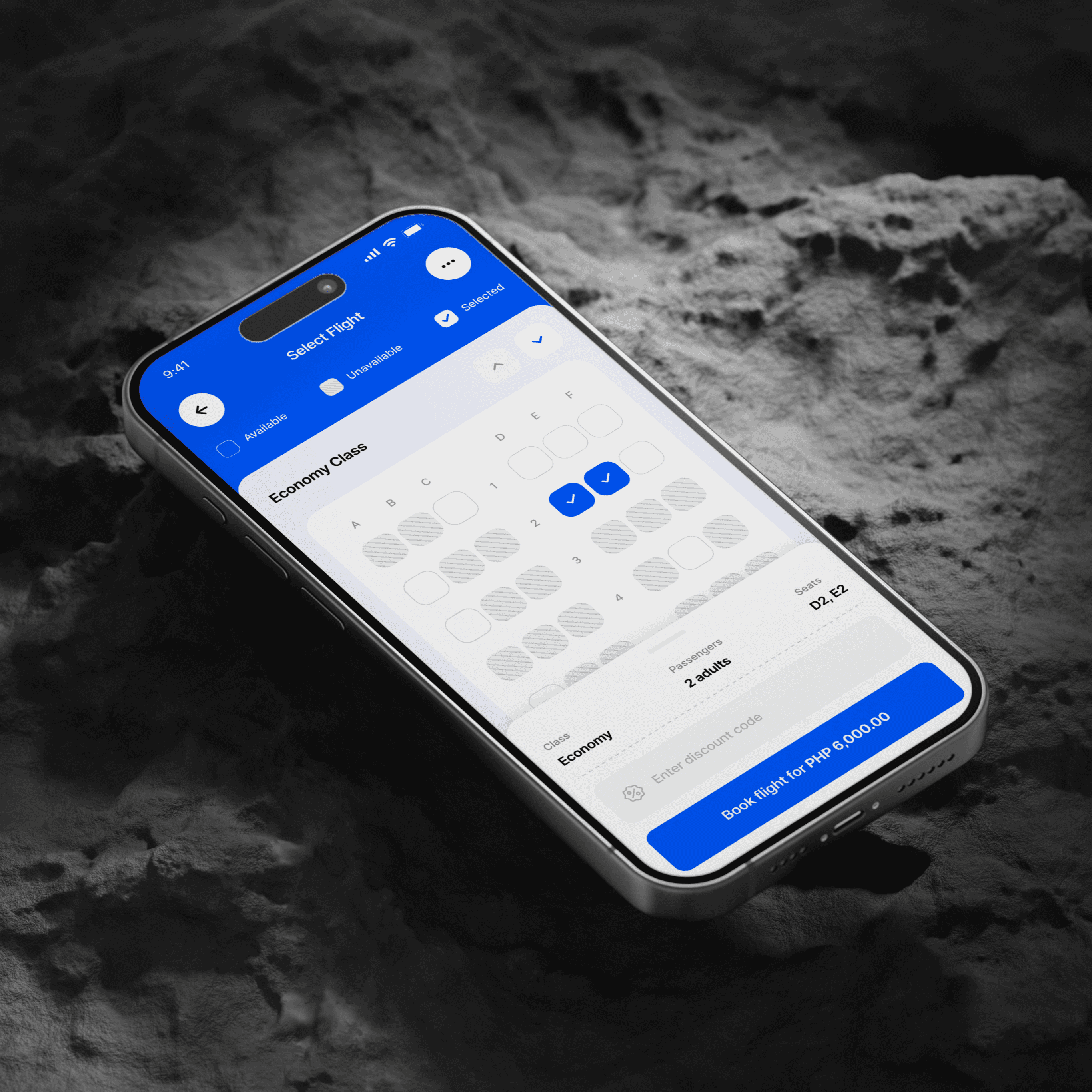
The final design significantly streamlines the booking process, reducing clicks by 30% and saving users up to 45 seconds per booking. An intuitive interface enhances the user experience, while an interactive seat map simplifies seat selection, cutting decision time by 40%. Critical flight details are prominently displayed for quick access, ensuring an efficient and enjoyable booking experience.
Simplified, Enhanced, Streamlined
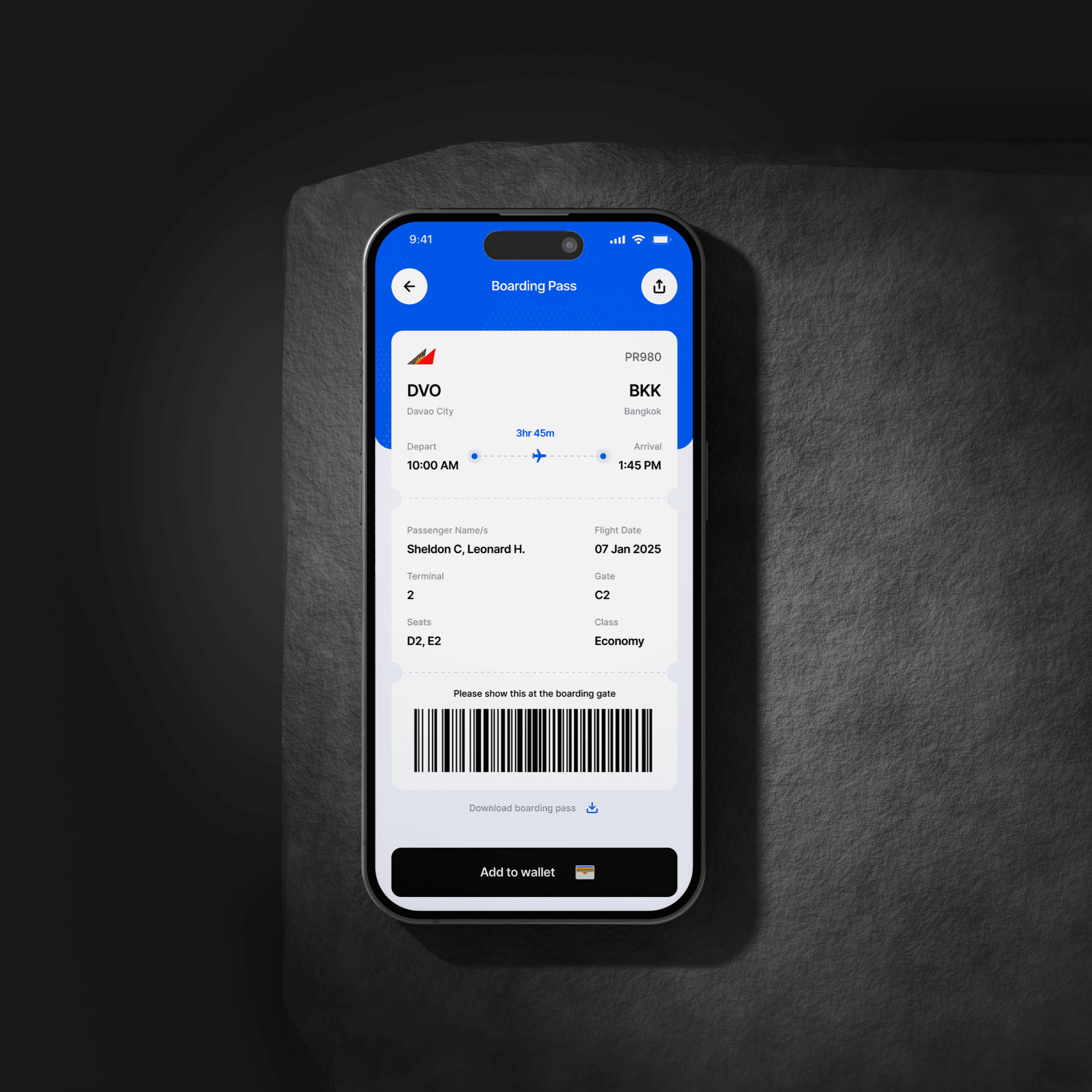
My goal for the booking app was to simplify the entire booking process, making it intuitive for users to search and book flights effortlessly. I aimed to enhance the user experience with a clean and user-friendly interface. Seat selection was streamlined through an interactive and easy-to-use feature. Additionally, I provided essential information, ensuring all critical flight details were easily accessible, making the flight booking experience seamless and enjoyable.
Ideating Features for a Better Flight Booking Experience
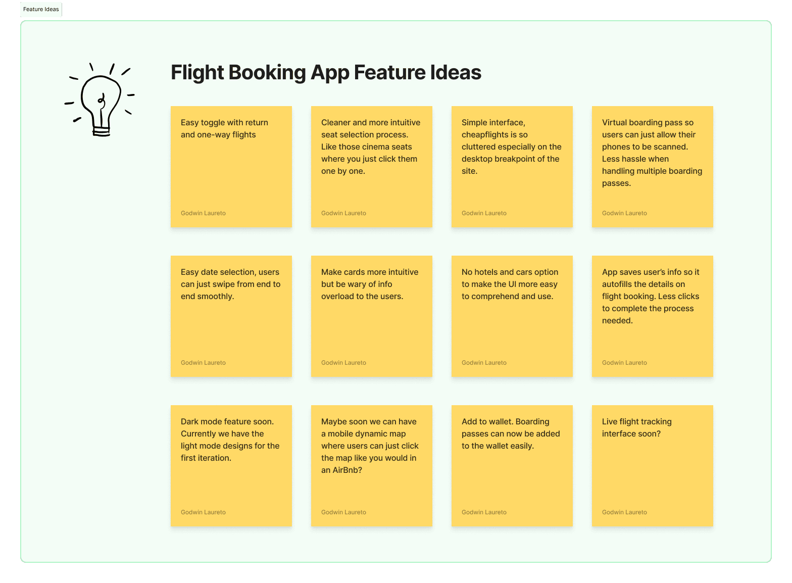
I started by brainstorming various features that would enhance the flight booking experience. Some key ideas included:
Easy toggles for return and one-way flights.
Cleaner, intuitive seat selection, akin to selecting cinema seats.
A simple interface to address the clutter found on many booking sites.
Virtual boarding passes to streamline the check-in process.
Auto-saved user info for faster booking and a future dark mode for user preference.
Mapping and Refining the User Flow
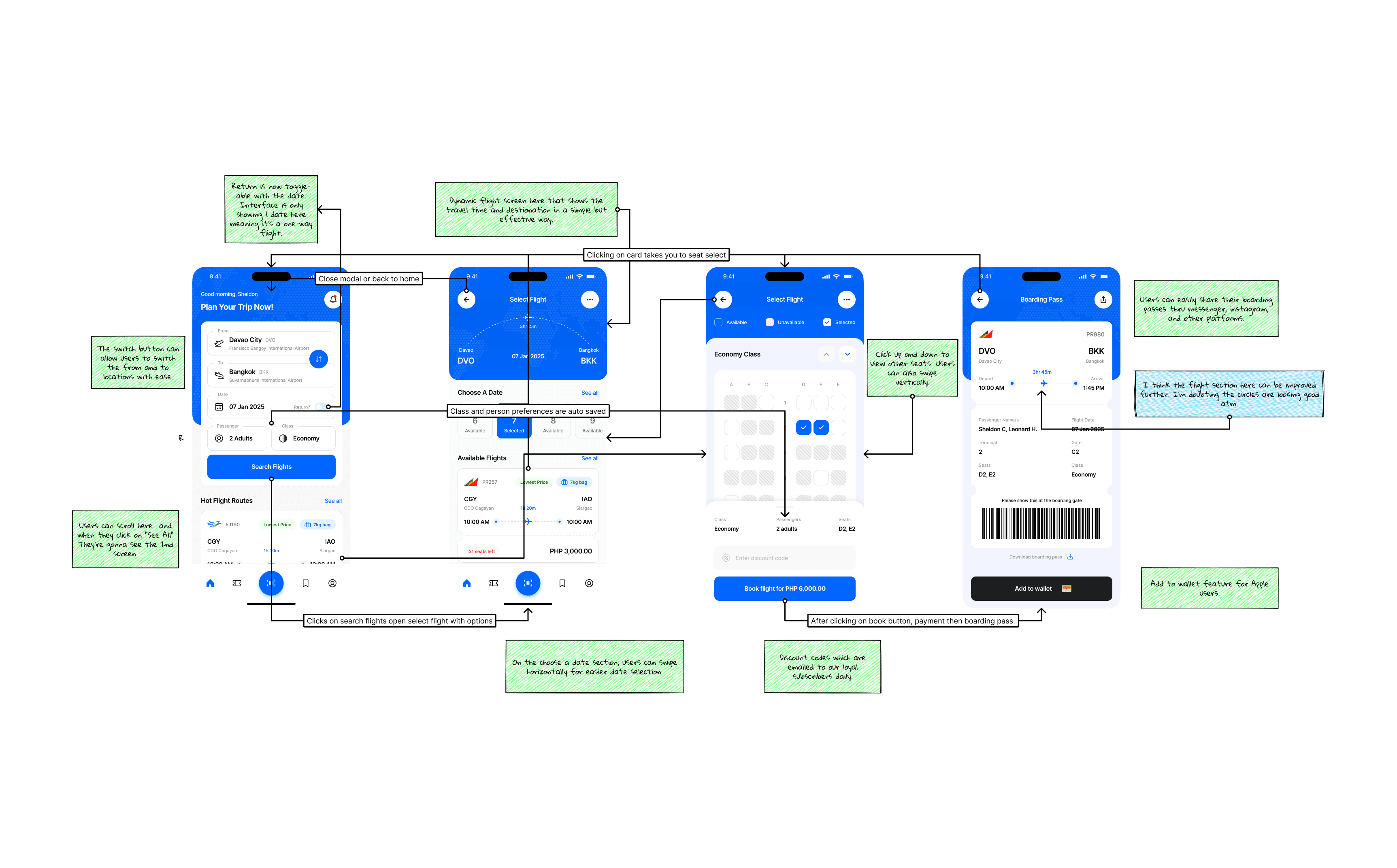
Next, I mapped out the user flow to ensure a smooth booking process. The flow chart illustrated key steps, from searching for flights to boarding. I minimized steps and made interactions straightforward. Users can easily swipe to select dates, save class and person preferences, scroll vertically for seat selection, and add boarding passes to their wallet. This iterative design approach ensured optimal usability.
Wireframe Development
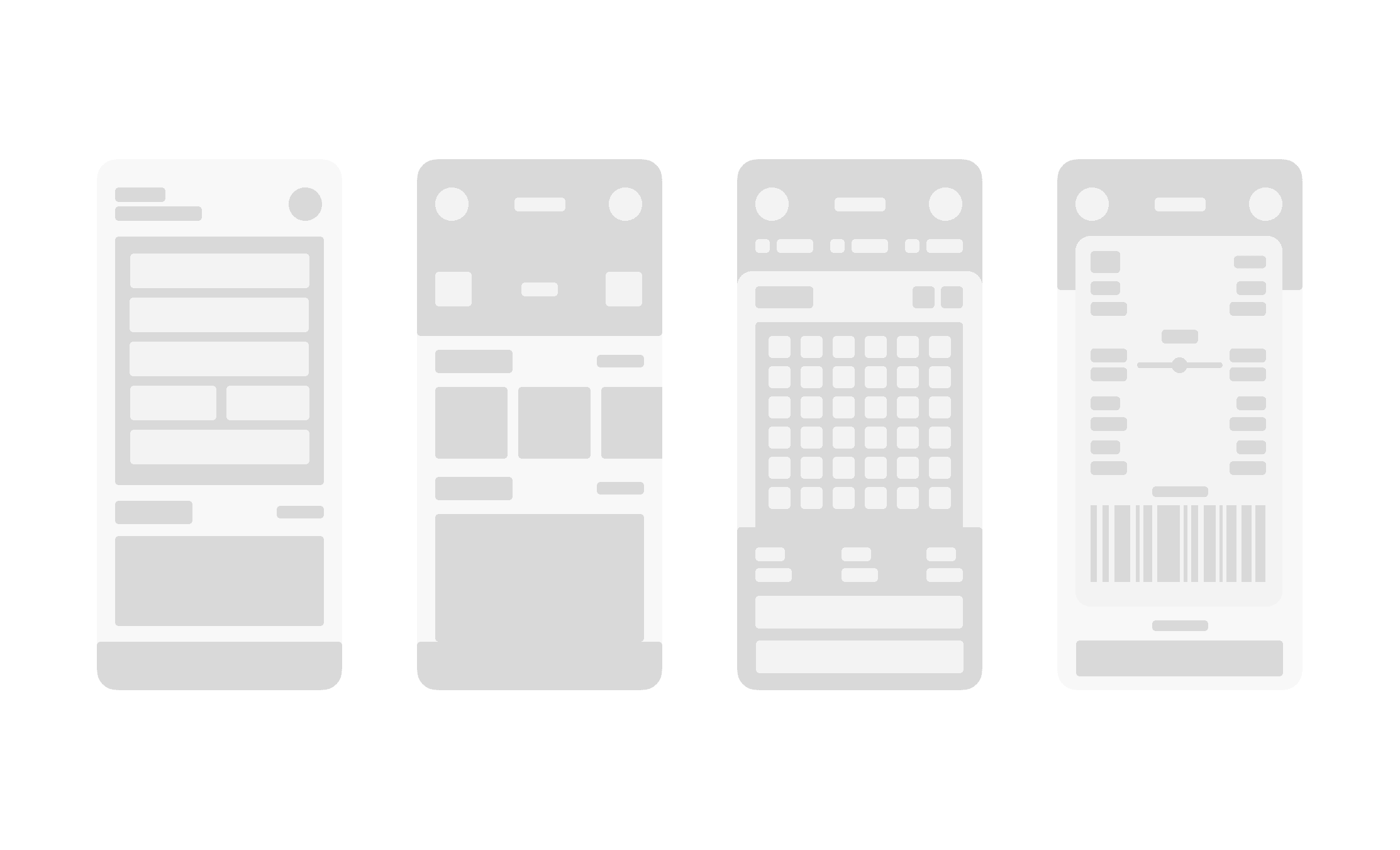
I then proceeded to the next step by sketching the main screens for the flight booking app, focusing on clarity and simplicity. The home screen allows users to search and book flights easily, while the flight selection screen offers clear options. The seat selection screen features an intuitive, interactive map. Through several iterations, I refined the wireframes based on feedback, addressing potential issues early. This process ensured a user-friendly experience that catered to both novice and experienced travelers.
Enhancing the Flight Booking Journey
Redesigning this flight booking app was an insightful journey. Simplifying the booking process and creating a clean, intuitive interface helped cut booking time by up to 45 seconds. Iterative testing and user feedback highlighted the importance of balancing simplicity and functionality. Overcoming feature overload by focusing on essential information taught me the value of prioritizing user needs. This project reinforced how thoughtful design can transform complex tasks into seamless experiences, making the booking process not just easier but enjoyable.
